
Data Analysis
The reason we selected this type of business is because of the recent trend of Australia importing from South Asian countries.
The reason we selected this type of business is because of the recent trend of Australia importing from South Asian countries.
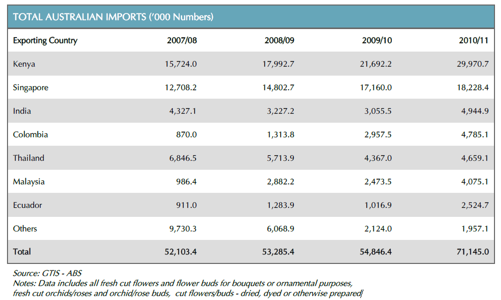
From the pie charts below, we can see that there is a increase of imports from Kenya. The reason for this was found to be that the exports from other countries have decreased in quality.


When we analysed the floriculture industry in Australia, we found that there is a gap in the supply and demand. For the year 2011, Flower retailing in Australia had 930 million revenue while 2553 retailers were in operation. For the same year however, the floriculture production was valued with only 330 million revenue and 940 suppliers. (IbisWorld, 2014) To bridge this gap, Australia has to import floriculture products from overseas.
The two graphs below support the argument that Australia had imported more floriculture products to fill it’s gap in demand. We can see an overall increase in total imports as well as a sharp increase in floriculture imports by Australia. (CIA World Factbook, 2012)
The two graphs below support the argument that Australia had imported more floriculture products to fill it’s gap in demand. We can see an overall increase in total imports as well as a sharp increase in floriculture imports by Australia. (CIA World Factbook, 2012)


When we look at the import/export data for Sri Lanka, we found that the total imports have a trend to increase while floricultre exports have reduced, as shown in the graphs below (CIA World Factbook, 2012). We believe that the decrease of floriculture exports is an oppurtunity for an prospective business venture.


When analysing the target market, we found that the median age of Australia was 38.1 years as of December 6,2013. (CIA World Factbook, 2012) Since flowers are required for occasions such as weddings, we analysed the population and the age to determine our target market.
|
Male |
Female |
|
|
0-14 |
2061973 |
1957558 |
|
15-24 |
1531325 |
1453940 |
|
25-54 |
4748667 |
4598259 |
|
55-64 |
1308660 |
1326220 |
|
65-100 |
1509460 |
1766439 |

We felt that the above date we found was not specific to our needs, as the class width of 25-54 is too large to draw any conclusions. Therefore we opted to find a more specific or broken down set of data.

The above illustration shows a higher density in the population in the ages of 24-50, which is analogous with the data we found earlier. This chart gives a better representation of the population structure according to age as we wanted. From this data, we observed that there is a large amount of people in the age range of 20-35, with the same density as the middle age group of 30-40. We selected these age groups as it is the age most people marry. We assumed there would be a large amount of consumption of cut flowers for the weddings that would take place.
